Showing posts with label colour. Show all posts

6.10.2009

Kandinsky on colour

"Generally speaking, colour is a power which directly influences the soul. Colour is the keyboard, the eyes are the hammers, the soul is the piano with many strings. The artist is the hand which plays, touching one key or another to cause vibrations in the soul."
- Wassily Kandinsky in Concerning the Spiritual in Art, 1911

Centre Georges Pompidou, Paris, France.
Kandinsky expo poster photographed from the roof.
April, 2009


3.13.2009

Human Marks

"A stitch is a very credible mark." - Dorothy Caldwell


kanthaCropped

Free-hand stitched kantha sampler
Embroidery floss on
two layers of black cotton
4 x 7 inches


I stitched this in a two-day class called Human Marks taught by Dorothy Caldwell, offered through the Kingston Fibre Artists' Guild. The course was designed to run for five days so the two-day class was a somewhat condensed version. Nevertheless, I had the impression of things slowing way down. We worked with our fingers and ink, pens, brushes, candle smoke, wax, hammer and nail, and needle and thread to make marks of one sort and another, repeating them, overlapping them, changing speed and direction and so on.

It seems to me that most of what I produced, expressed by way of many discrete marks, suggested not so much a series of images, but something unintended or unconscious, the suggestion of something, perhaps something forgotten. An interesting couple of days, and a nice trip away from home.

If you find yourself in that neck-of-the-woods be sure to check out the Kingston Fibre Artists exhibit, Inspiration and Exploration currently at the Kingston Public Library, 130 Johnson Street, Feb 28 - March 30.

1.26.2009

Gradient dyeing

Below are photos of some gradient dyeing that I started in a class in contemporary quilting I'm currently taking. I had hoped to do quite a bit more of this, but to date have not found the time. I'm especially interested in complementary colour-to-colour gradient dyeing (4) and exploring the different hues of brown which might be obtained. Eventually these fabrics will be used to make a small quilt for the class, Art Quilt Series, taught by Elaine Quehl, local quilt artist, teacher and dyer. Elaine is a generous teacher with a warm spirit who is passionate about her art. She currently teaches many great classes in and around Ontario so do check her out.

1.2.3

4.5.6
1. 100% cotton fat quarters batching overnight in Procion MX dyes in zip-loc bags hanging on a clothes drying rack.
2
& 3. Dyed fabric after a first rinse.
4. Golden yellow(G&S Dye 204)-to-purple (G&S 904) hue-to-hue gradation; 7 steps
5
. Soft brown (G&S 611) colour gradation ; 5 steps
6. Grey (G&S 701) colour gradation; 5 steps

10.20.2008

Red Onions

redOnionsCropped

"Red Onions"
Commercial and hand dyed cottons
Raw edge applique, hand and machine quilted, hand tied

11 x 11"
2008

This piece is going out to Susie Monday of El Cielo Studio in partial fulfillment of my participation in the Pay it Forward Exchange. Another small piece that I did this year, called Hopscotch, will go out to Amy Moak of All My Stuff, who also signed up to receive something handmade from me, in return for her participation in the challenge. Thank you Susie and Amy for your interest.

And while I'm at it, I thought I'd mention the annual Shadowbox exhibit, which is currently on at the Textile Museum of Canada in Toronto. Browse the textile art gems currently on display at the museum's website. The exhibit is a fundraiser and all works are for sale by bidding. Bid in person at the show or if you have the cash, attend the Shadowbox Auction and Cocktail Party. I especially like this one entitled Cutting Edge by Kate Hyde.

6.17.2008

Recent goings on

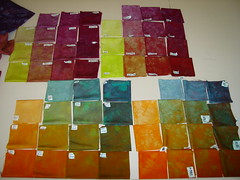
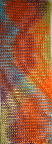
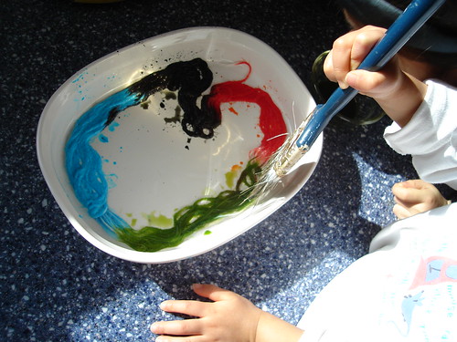
Earlier this year I posted about a project I was doing with my daughter's elementary school class. For several months we dyed cotton using Procion MX dyes, including stamping with print paste, clamping, tying, and stitch resist dyeing. In all, the children created seven meters of brightly coloured cotton fabric one fat eighth at a time. I was amazed at some of the pieces that they made and the experience reinforced my notion that most children come equipped with an innate sense of colour and composition. In late Spring we gathered all of the dyed fabric together and the students decided to make one large quilt using their hand dyed fabrics. We mostly tied the quilt, which was about as much as this age group could handle. Although it was tempting, I resisted adding a whole lot of machine quilting as I wanted the finished quilt to be predominantly their own work. Below are some photos showing them putting the quilt together.


DSC05614
Making the quilt sandwich
DSC05619
Basting the quilt

binding
Sewing on the binding.


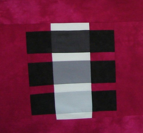
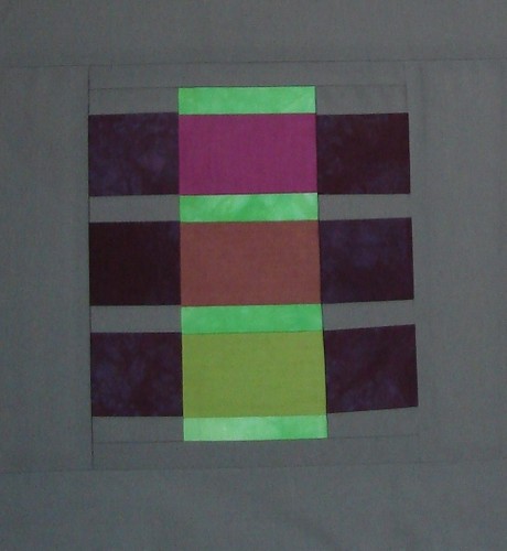
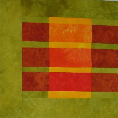
These are are some of my favourite blocks:

clamped turtle lattice


trio_1 trio_2


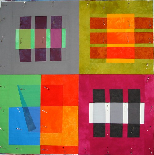
And the finished article, which is 57 x 72 inches:

finished


Besides finishing this project I've been busier than usual these past few weeks. Among other things there was my sister-in-law's 'big fat marathon wedding', which consisted of two tea ceremonies, a wedding in her home (what were they thinking?) and a huge reception in the evening. The poor girl was up at 5:30 in the morning on her wedding day to have her hair and make-up done in time for the first event of the morning. I swear, the person who thought of starting married life with a wedding was a true sadist. Below is a photo of my contribution to the gala affair: a small silk ring pillow that my sister-in-law requested I make in green and burgundy, a nice colour combination. She loves the look of low water immersion dyed fabric and I was happy to oblige. Note the classy rings.

DSC05436_cropped


A word about my participation in the Take if Further Challenge that SharonB is running this year. I have been away from the challenge goings on for most of last month and into this month. To be more precise, life got hectic and I've been away from the computer. I've started working on a large-ish quilt, based on May's concept and plan to have it finished by mid July. I know that doesn't really fit in with how Sharon is running the challenge so I hope that she'll humour me. I plan to manipulate and use a few digitized images of drawings that I've made recently in a drawing class, juxtapose these with other images and collage them together into a quilt which will address the question posed by May's concept: "What do you call yourself and why?" I'll post regular reports on my progress and in August I'll go back to working on smaller works for the monthly challenges again. In the meantime have a look at the challenge concept for June as well as some of the work that's being made [link][link].

I also want to state that I've decided to enter a few pieces into a juried exhibit. It's a biennial show called Fibreworks put on by Cambridge Galleries of Cambridge, Ontario. I have never entered work in a show, and for that matter, have never exhibited work anywhere. I have been told that Fibreworks is a cutting edge exhibition populated mostly with the work of very accomplished artists and for this reason I will be surprised if one of my pieces is juried into the show. However, I am looking forward to the experience. As a quilt artist and friend said when I told her I wanted to enter some pieces, "You have to start somewhere."
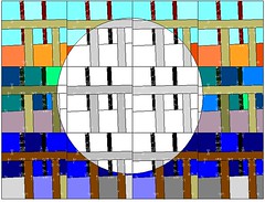
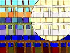
4.30.2008

April TIF - Part II

In my last TIF post I mentioned an unbidden image which came up for me when I read Sharon B's April TIF concept. I said I would incorporate that image into my April TIF challenge piece.The image was of myself as a baby in a crib. I've heard some stories over the years from various family members about those early days. Not all of them very happy ones. I have the sense that a lot of us may have been asked to spend quite a bit more time our cribs than was actually necessary. Just a guess. Probably for that reason, I'm not a big fan of cribs. Both my daughters slept with my husband and I for the first few months after which we moved them to a futon on the floor of their own bedroom. It was much easier to change the baby, put her down to sleep and easier to deal with her when she woke up crying in the night; we would just go in and lay down for a while on the bed. It worked for us. I thought about the crib image for a while, not sure how it might inspire a small quilt or piece of textile art. After awhile I came up with the idea of a repeat block based on the bars of a baby crib. Below left is an image cropped from a photograph of a crib. Below right is a quilt block based on the image.


Here is the block repeated four across, three down.


I added some colour, and an orb (below left),to suggest the sun rising, thereby representing the passage of time which I also said that I would incorporate into this piece. Then I shifted the orb to the right side of the piece (below right),


and simplified the whole thing somewhat by removing half of the blocks for a total of six blocks instead of twelve. I also flipped over some of the blocks to break up the patterning a bit. The sun then became a much bigger part of the overall composition.


I wasn't sure what kind of a time commitment this would turn out to be but the next step was to take it to fabric, which would represent the element of positive transformation that I also wanted to convey in the work. The idea of positive transformation is also addressed by taking a somewhat heavy memory and injecting it with colour and movement.

April TIF - Part III

Related posts: April TIF -Part I, April TIF - Part II

Here are the first six blocks pieced together. What I liked about making them was cutting the fabric free hand with the rotary cutter. The effect is that there's a bit of variety and movement added to the blocks.

6blocks

Looking at these six block I realized that I was moving away from my original colour scheme and that I was also spending more time on the project than I had originally intended or could afford. I had been wanting to make a quilted cover for our piano keyboard for quite some time. We have a small, apartment sized Yamaha with no keyboard cover built into it. Thus, the keys sometimes get quite dusty, (like when I haven't dusted for a while). When I laid the six blocks end to end, they fit the piano keyboard perfectly so I sewed them together end to end, like so.

4BlocksLong

Added batt and pin basted,

pinnedLong


quilted and bound, et voila, a happy piano and April's TIF challenge completed.

piano

Keyboard Cover
Commercial and hand
dyed cotton and silk
Machine pieced
Machine and hand quilted
8 x 52"
April 2008


detail_3

Detail

4.02.2008

Quilt finished

I posted about this quilt early last year when I started putting it together. The design was inspired by a colour exercise in a book I was reading called The Interaction of Color by Joseph Albers. In the meantime, the finished quilt top has been hanging on my design wall where I have enjoyed looking at its brightly coloured squares while deciding what to do about the quilting. Last week I got to it.

First I machine quilted black
concentric circles offset from
the lower right-hand corner
and hand quilted quarter ovals
starting from the lower left-hand corner
which intersected the black circular
stitching,


then added a narrow black binding.


Colour study: The illusion of transparency
Hand dyed cottons, machine pieced,
machine and hand quilted
29 x 29"
March 2008


Detail

3.29.2008

Colourful Inspiration

Brenda Smith of Serendipity Patchwork and Quilting posted last week about an opportunity to win a painting by artist Abie Loy Kemarre by filling out an online survey and subscribing to the newsletter of the gallery, Central Art Aboriginal Art Store. After doing so, I soon found myself on another site called Aboriginal Art Directory viewing slideshows of some really amazing artwork there. Have a look at these Aboriginal Artists Slideshows for some colourful inspiration.

Flickr artists are another great source of inspiration for me. Some time ago I stumbled across the excellent photo collage work of Roger Kellison aka Rogerio, who kindly gave his permission to post his work here and to use it as a source of inspiration for a quilted textile collage.


collage287
Roger Kellison


He explains the process he uses to create his collages this way:
"it is largely trial and error of layering pics until I find something I like...and then enhancing the resulting image. Usually this is done by darkening and cropping the collage. [I] often will turn one or other image on it's side or even upside down. Just playing around you could say."


collage106
Roger Kellison


Roger also introduced me to flickrleech, a very cool online tool that allows you to view any flickr user's account 200 photos at a time, because, as the flickrleech developer so eloquently states, paging sucks. You can view Roger's work on flickrleech here.

3.14.2008

TIF March 2008

My TIF challenge piece this month uses SharonB's concept and colour scheme (well, OK, I swapped a couple of colours). She writes,

Do you ever notice the little things, the small moments, the details in life? This month's challenge is to do just that, pay attention to the tiny details. Sometimes the small things become emblematic for something larger.
In Toronto last week I walked by this window display at the Mokuba ribbon shop at 575 Queen Street West, a bit hard to see in this photo due to the glare on the window, but it gives you an idea.


These three simple, yet beautiful hangings, made of coloured ribbons, inspired me to create something that would capture this small detail of a walk in the city; a colourful window display on a snowy, white winter day. This is the little thing that got me started on my March TIF piece.


First I played around with a
couple of strips of paper painted
with acrylic, twisting them in different
ways to see what kind of patterns
I might get.Above is an example of
something I liked.


Then I painted some brown packing paper
in several colours, the purple, green
and gold are from Sharon's colour scheme,
though they darkened up considerably
when they dried.


Dried and fused the paper and cut
it into strips.


Starting to play...


...going somewhere...


...adding the last strips of twisted paper
ribbon.
Et, voila...


Ribbons on Queen Street
Acrylic, paper, raw canvas
fused
16 x 19"
March 2008


detail

8.07.2007

The journey to black


"Brown is just a waystation on the journey to black" -Carol Soderlund
I came home last Saturday exhausted after five days at Quilting by the Lake in Morrisville, NY, USA. I learned a bunch of new stuff in the dyeing class that I took there with Carol Soderlund. Pictured above are the 2D hue to hue gradation matrices dyed by some of the class participants. Neither the class nor the week was much like what I had been expecting, not necessarily a bad thing. It was intense, and I was in overload mode for a good part of the time. A highlight of the week was touring the classrooms and seeing what other workshop participants were doing. I did dye a bunch of fabric and will post pictures of that some other time. For now I'm putting together the class supplies for a workshop I'm taking this weekend called Exploring the Surface: An Integrated Approach with Judith Trager. I am more than a little pleased that the class supply list includes acrylic paint and media. After this weekend though I think I'll be all "workshopped-out" for a while.

7.15.2007

KoolAid dyeing with yarn

Kristi Porter wrote a good tutorial on dyeing yarn with KoolAid at knitty.com. I had seen a lot of this in my blog travels and thought it would be fun to try with my kids. It was tons of fun but it really got me wondering about the KoolAid, which in my hands behaved like some kind of industrial grade dye. So, obviously not the best stuff to be drinking.

The yarn below (top left) is a single-ply silk yarn that I love. It's very fine, much like a heavy weight thread. I painted a small skein of it to see how it would turn out. The colours are not as bright on the silk as they are on a wool yarn, but I quite like the results.


Here (bottom left) is a photo of the rolled silk yarn after it had been rinsed and dried. Above right is a small swatch (~2 x 6 inches) that I knitted up with it. I quite like the movement of colour from side to side across the swatch. I think this happened because the length of the individual colours painted onto the yarn was approximately the length needed to knit across one row of the swatch. The colours seem to shift a bit with each row so the end result is that several waves of colour seem to migrate back and forth across the swatch. Is this what's called pooling? Because I like it.

Flavours used:
  • The orange is orange
  • The green is lemon-lime
  • The blue is ice blue rasberry lemonade
  • The purple is grape

Here are the same colours painted onto wool:

rolledBall rolledBall


Here are the same colours on wool with a blast of tropical punch added to the mix:

yuyingSock


Additional links:
http://www.flickr.com/search/?q=koolaid+dye
http://www.ipomoea.org/emma/kadye/kadye.html
http://www.pburch.net/dyeing/FAQ/drinkmix.shtml
http://www.pburch.net/dyeing/fooddyes.shtml
http://www.thepiper.com/fiberart/koolaid/images/colorchart-max.jpg

2.21.2007

Josef Albers: Illusion of transparence

I have this book, The Interaction of Color by Josef Albers, out of the library at the moment. First published in 1963, it appeared in paperback in 1971 and has remained in print ever since. This, the most recent edition was published in 2006. It was written as a workbook for teachers and students. Each chapter touches on a different aspect of colour theory such as relativity, intensity, contrast, mixture, subtraction, transparency and transformation. Albers writes,

"The book is a record of an experimental way of studying and teaching color. The aim of such study is to develop--through experience--by trial and error--an eye for color."
I was most interested in the work with transparency discussed in Chapter IX: Color mixing in paper--illusion of transparence. The idea is to to mimic colour mixing but to work with coloured paper not directly with paint. I wanted to do this using fabric and started with this example from the book.


In my first 15" x 15" block I re-created an image of three black bars laying over a white strip, against a medium colour background. The impression of transparency is created by laying intermediate colour fabrics adjacent to the lighter fabric in such a way that the lighter colour appears to show through the bar of fabric laying over it.

This is my first blocki

my second made anoti

and my third tine I mi

Next, to try something different I worked from another paper collage, again from Alber's book in which he has placed colours together in such a way as to give the impression of a clear sheet of plastic laying over four coloured squares,

and then I made anot

I chose my fabrics thi

and put my blocks together like so:


Besides playing with colour mixing and transparency I worked without templates or a pattern for the first time. I cut the fabric free-hand with a rotary cutter which was very freeing and felt great.

Lessons learned: When choosing fabrics it was very difficult for me to judge whether I was actually getting the effect that I wanted when looking directly at the fabrics. What helped a lot was looking at the fabric from a distance, reflected in a large mirror that I have hanging on the wall of my work room.

Next, I'll machine quilt this piece. One person who has seen it suggested black concentric circles placed a bit off-center. I need to decide between black thread or a variegated multi-colour thread. We'll see.

Here are more examples of work that plays with the effect of transparency in different media. Click on an image to see it in its original context.

Ingela Albers
Transparenz
1954
Emily Holyfield
Purple Haze
Josef Albers
Volando
1935
LĂ¡szlĂ³ Moholy-Nagy
A19
1927
oil on canvas
Barbara McQuarrie
The Power of Nine
Quilt
Robbi Joy Eklow
Fused fabric