Showing posts with label TIF2008. Show all posts

7.07.2008

May TIF - Part II

I tried a few new things with May's TIF piece: photo transfer paper, oil paint sticks and hand tyeing. The image of a heart was drawn by Jason Reid and used with permission. For more info about the concept read here.


mother_rotated

Mother
Hand dyed and commercial cottons;
Shiva paint sticks, photo transfer;
Machine pieced, hand and machine quilted,
hand tied;
14 x 20"
July 2008


detail

Detail


Related post: May TIF - Part I

6.28.2008

May TIF - Part I

What do you call yourself and why?

was May's TIF Challenge concept question. I got started on it last weekend. Yes, I know it's the end of June but I liked the concept question and decided to do the assignment anyway.

Presently, if asked, I call myself a mother and a quilt artist. Making this small quilt top partly addressed the identity of quilt artist. In addition I included a strip of a traditional quilt block: flying geese, to further speak to this identity in a straightforward way. I decided to use an anatomical human heart to describe my role as a mother. In western culture the heart is used to represent or symbolize many of the attributes that are essential in the day to day care and nurturing of young children. Among these, love and compassion, honesty, forgiveness, and joy, are supremely important. Additional requirements necessary for effective parenting, and commonly symbolized by the human heart, include stamina, endurance, strength, good health and steadfastness. The image of a heart was drawn by Jason Reid and used with permission. I fragmented the heart to represent the reality of struggle or hardship, which along with joy, is part of family life. In overall design the quilt is a simple collage of fabrics.


quiltTop


The piece was made as a prototype for a larger quilt that I want to make, to further address the question posed by the May TIF challenge question in which I intend to use several unfinished drawings that I made recently in a drawing class. Here in the smaller quilt, I experimented with photo transfer paper for textiles and used three different products to transfer the drawing of the human heart onto fabric. The products I tried were June Tailor Print 'n Press, Wilton Easy Image fabric transfers and HP iron on transfers. I was most happy with the results that I obtained with the HP transfer paper, as it was the least stiff and resulted in less colour distortion than the other two products. It was also the least expensive.

Oh yeah, and don't forget to flip your image before you print it to the transfer paper as the transferred image will be the reverse of what is printed on the paper. As you can tell, if you closely examine the image of the heart.

In truth, I would like to find another way to transfer drawings and digital images to fabric, one that would better retain the hand of the fabric which transfer papers do not do. Something that I would like to learn more about, is digital printing with fibre reactive dyes, a technique used by quilt artists Michael James and Miriam Nathan-Roberts. If you use digital image transfer techniques in your textile art which you can recommend please leave me a comment or drop me a line about what works for you.

4.30.2008

April TIF - Part II

In my last TIF post I mentioned an unbidden image which came up for me when I read Sharon B's April TIF concept. I said I would incorporate that image into my April TIF challenge piece.The image was of myself as a baby in a crib. I've heard some stories over the years from various family members about those early days. Not all of them very happy ones. I have the sense that a lot of us may have been asked to spend quite a bit more time our cribs than was actually necessary. Just a guess. Probably for that reason, I'm not a big fan of cribs. Both my daughters slept with my husband and I for the first few months after which we moved them to a futon on the floor of their own bedroom. It was much easier to change the baby, put her down to sleep and easier to deal with her when she woke up crying in the night; we would just go in and lay down for a while on the bed. It worked for us. I thought about the crib image for a while, not sure how it might inspire a small quilt or piece of textile art. After awhile I came up with the idea of a repeat block based on the bars of a baby crib. Below left is an image cropped from a photograph of a crib. Below right is a quilt block based on the image.


Here is the block repeated four across, three down.


I added some colour, and an orb (below left),to suggest the sun rising, thereby representing the passage of time which I also said that I would incorporate into this piece. Then I shifted the orb to the right side of the piece (below right),


and simplified the whole thing somewhat by removing half of the blocks for a total of six blocks instead of twelve. I also flipped over some of the blocks to break up the patterning a bit. The sun then became a much bigger part of the overall composition.


I wasn't sure what kind of a time commitment this would turn out to be but the next step was to take it to fabric, which would represent the element of positive transformation that I also wanted to convey in the work. The idea of positive transformation is also addressed by taking a somewhat heavy memory and injecting it with colour and movement.

April TIF - Part III

Related posts: April TIF -Part I, April TIF - Part II

Here are the first six blocks pieced together. What I liked about making them was cutting the fabric free hand with the rotary cutter. The effect is that there's a bit of variety and movement added to the blocks.

6blocks

Looking at these six block I realized that I was moving away from my original colour scheme and that I was also spending more time on the project than I had originally intended or could afford. I had been wanting to make a quilted cover for our piano keyboard for quite some time. We have a small, apartment sized Yamaha with no keyboard cover built into it. Thus, the keys sometimes get quite dusty, (like when I haven't dusted for a while). When I laid the six blocks end to end, they fit the piano keyboard perfectly so I sewed them together end to end, like so.

4BlocksLong

Added batt and pin basted,

pinnedLong


quilted and bound, et voila, a happy piano and April's TIF challenge completed.

piano

Keyboard Cover
Commercial and hand
dyed cotton and silk
Machine pieced
Machine and hand quilted
8 x 52"
April 2008


detail_3

Detail

4.10.2008

April TIF - Part I

This month's Take it Further challenge concept is this question from SharonB:

How do you see change?

I related fairly strongly to something that she said in her post,

"It amuses me when people say we have to learn to live with change as change has always been part of life. As soon as we are born we start to grow in other words we start to change."

The first thing that came to mind when I read this was an image related to the first year of my own life, not that I remember anything from that period, I guess that's the point. But the image was there, nevertheless. So, my challenge piece will somehow relate to that image.

How do I see change? Change may bring new opportunities or great joy, as in the birth of a child. It can also bring loss, regret, sadness or pain, such as in the death of a person we love. And it may bring both. The loss of a job may bring with it the discovery of a previously unimagined and inspiring new career path. In the case of difficult change (the positive sort is easy; you celebrate!) I rather try to approach change in terms of the hidden potential for personal growth, no matter how it may appear at the outset. Work with it, as one would with clay, steadily remolding it into something that will hopefully give rise to a positive transformation.

For me, the inevitability of change is also (obviously) inextricably linked with the passage of time. So for this month's piece I'll begin working with these three ideas; (1) An unbidden image relating to the first twelve months of life (2) The passage of time, and (3) Positive transformation. Sound cryptic? It does to me too.

3.14.2008

TIF March 2008

My TIF challenge piece this month uses SharonB's concept and colour scheme (well, OK, I swapped a couple of colours). She writes,

Do you ever notice the little things, the small moments, the details in life? This month's challenge is to do just that, pay attention to the tiny details. Sometimes the small things become emblematic for something larger.
In Toronto last week I walked by this window display at the Mokuba ribbon shop at 575 Queen Street West, a bit hard to see in this photo due to the glare on the window, but it gives you an idea.


These three simple, yet beautiful hangings, made of coloured ribbons, inspired me to create something that would capture this small detail of a walk in the city; a colourful window display on a snowy, white winter day. This is the little thing that got me started on my March TIF piece.


First I played around with a
couple of strips of paper painted
with acrylic, twisting them in different
ways to see what kind of patterns
I might get.Above is an example of
something I liked.


Then I painted some brown packing paper
in several colours, the purple, green
and gold are from Sharon's colour scheme,
though they darkened up considerably
when they dried.


Dried and fused the paper and cut
it into strips.


Starting to play...


...going somewhere...


...adding the last strips of twisted paper
ribbon.
Et, voila...


Ribbons on Queen Street
Acrylic, paper, raw canvas
fused
16 x 19"
March 2008


detail

2.21.2008

TIF February 2008 - Part II

OK. This piece is finished. I don't have much to say about it. I added a couple of more details. As I'm not a big fan of appliqué I used acrylic paint for this. I got a bit hung up on it because of the fabric colours. Although I had not intended, the thing was already pretty dark, so placing a dark shadow on the front of it wasn't working for me. I wanted the 'shadow' of a child playing hopscotch to stand out on the front of the piece. I chose silver paint for that. Not sure I like it. I got the image that I wanted but it most definitely does not look like a shadow, hmmm. I also placed a fence across the front. I saw a space between two buildings there and I wanted to put a barrier across that space. One often finds fences near playgrounds.


finished_cropped

Hopscotch
Commercial and hand
dyed cotton, acrylic paint
Machine pieced and quilted
11 x 13"
February 2008


detail

Detail


Related post: TIF February 2008 - Part I

2.13.2008

February 2008 TIF - Part I

February's Take it Further challenge concept is this question:

What are old enough to remember?
Well, for starters,
  • Playing with tinker toys, pick-up sticks, hoola-hoops, jacks, metal slinkies, clamp-on roller-skates that tightened with a key, and playing hopscotch and double dutch
  • A $0.10 weekly allowance, going to Expo '67 in Montreal, cigarette ads on black & white TV, the Friendly Giant, Mr. Dressup, Ed Sullivan, Lawrence Welk, Laugh-In, Archie Bunker, Saturday Night Live and Monty Python's Flying Circus.
  • Rotary telephones, writing term papers on a typewriter, polaroid cameras, lava lamps (the first time around), 8-track tapes and the day my grandparent's bought their first colour television set
  • The assassination of Martin Luther King, the Black Panthers, the Weathermen, Patty Hurst, the Mai Lai Massacre, the end of the Vietnam war, the trial of the Gang of Four, the impeachment of Richard Nixon, the Quebec October Crisis, the defeat of Pierre Trudeau, the defeat of Joe Clark and diethylstilbestrol
  • Bell-bottom pants, platform shoes and hip-huggers
  • Mary Poppins, the Beatles and Jefferson Airplane
  • When a healthy diet meant regular servings of Campbell's soup, Wonder Bread, reconstituted powdered milk, hot dogs, bologna, jello and cheez-whiz (Ugh!)
  • Coke in a glass bottle, candy cigarettes, hard rock candy, 5 cent candy bars, jaw-breakers and Mary Janes
As I thought about how to condense these memories into a concept that I could work with, I read this post in which Linda at Tango Musings says this about February's challenge:
Yesterday I bought supplies for one idea, but still don't know if this is one I want to do, after all, those of us of a certain age all remember the first moon landing. It doesn't feel original enough to work on something that is so much a part of all of our psyche.
And it struck me that I'd much prefer to focus on one thing, something personal and compelling, rather than try to find a way to encompass a whole slew of things from the pile of memories. Looking over the list I had made, it was the games that we played when I was a kid that strike me as something which belong to bygone era. Low-tech and simple, usually involving a rope, or a ball, or a deck of cards, we played them for hours on end, got up the next day and did it all over again. Hopscotch was one of these, and I thought it would lend itself fairly well to patchwork. I would try to improvise a hopscotch game from patchwork and then superimpose the shadow of a child playing on it. I did a few flickr searches to find some visual inspiration and pulled out these shots. Thank you to the photographers for permission to post them*.

*Click on a photo above to visit the photographer's flickr account


Here's what's happened so far:


DSC04793

Two preliminary sketches
fabricPick
Fabric picks including colours
from February's palette
DSC04807
Starting the patchwork...
DSC04809


shadow
Making a girl's shadow...

DSC04796
...with the dark brown sheer. I was
hoping that the sheer fabric would
mimic a shadow by darkening the
underlying fabric while still showing
what was underneath.
DSC04832
'Hopscotch' - 11 x 13"
However, the sheer fabric doesn't work quite the way I want it to. Many of the fabrics underneath are too dark and the image of the girl playing does not come across clearly enough.

My next step will be to try to place something else across the front, such as a gate or fence. I like the way the border looks a bit like a doorway or the space between two buildings, and I think I'd like to see some kind of barrier across the open area between the right and left border blocking out some of the quilt - like a barrier between the past and the present.

We're halfway through the month and I think I have time to finish this. That's the goal anyway. Now I'm going to do something that I haven't had time to do yet this month, take a look at what other people have come up with for this month's challenge.

1.30.2008

TIF January 2008 - Part III

Here is a short update on my January TIF Challenge piece. Since my last challenge post I started working on creating some thorny underbrush with acrylic paint on fusible. I ended up with what looked more like trees in winter, so I went with that. Below is a photo of one of the sets of the trees that I painted. I then ironed the painted fusible onto a piece of sheer fabric which will then be ironed onto the quilt top. I chose not to iron the fusible directly onto the quilt because I knew that I was going to want to layer things onto the quilt top and I figured this would be the easiest way for me to play around with the composition before nailing it all down permanently.


treesAcrylicOnFusible


After placing the trees onto the quilt top I felt like something was still missing so I created another bird image, much larger than the others, to place in the foreground of the work. The photo below shows the new components placed onto the quilt top: trees to the right hand side, barbed wire across the bottom (a fine black cord that I'll sew on and embellished perhaps with black beads or something else to give the feeling of barbs along the wire) and to the left, a bird soaring up into the air.


DSC04751


I have sandwiched the batting and basted the quilt top but I won't have time to finish this quilt by the end of January. I don't wish to rush the quilting and I have a sense that I will want to do a relatively greater amount of hand quilting on it than I had originally planned.

Clearly, if I am going to keep up with this challenge each month, I will need to learn to scale down my pieces to a more manageable size and level of complexity. I am truly inspired my some of the finished work that is being posted by other challenge participants here. Many people have obviously already honed their skills in the area of designing a doable project within the allotted time. That, or they have a lot more free time on their hands than I do. You can check out the challenge 'goings on' at the Take it Further Design Challenge flickr Pool, or on the Take it Further Blog, or from the links on SharonB's January Take it Further blog post comments. Have a browse...

Related Posts: TIF January 2008 - Part I, TIF January 2008 - Part II

1.17.2008

TIF January 2008 - Part II

Thank you to everyone who left comments on the 'Take in Forward January 2008-Part I' post I wrote two weeks ago. I really appreciate and enjoy reading your thoughts. There's alot happening among the challenge participants including a good bit of action on the TIF flickr pool as well as links to participating bloggers in the comments here. It's a real pleasure to browse around and see what other people have come up with working from the same starting point. Although, I've probably bitten off a bit more than I can chew in one month, I'm pleased with the way my piece is developing. I'm already getting antsy to do the quilting, a sure sign that I am feeling a strong connection to the work that is unfolding. Below are photos with a brief description of what I've done so far.

windows_1

Pieced together three windows to place in the background of the quilt. I wanted decreasing sizes of windows to give a senseof depth to the wide open space in the center of the piece but somehow I didn't manage this. So I'll work with these. Next time I would use patterns for this to get staggered sizes.
2_windows_fused_2

These are two of the windows set into the background fabric. They are fused from underneath with wonder-under. This is the first time I have used this product and I like the result.


freezerPaperBirds_3

I traced silhouettes of flying birds onto freezer paper and ironed these onto the fabric. I mixed up some acrylic paint in a pale turquoise colour which I thought would give the feeling of light reflecting off white birds high in the sky.


acrylic birds_4

After looking at this for awhile I decided that these birds by themselves were too light so I threw a second darker group of birds into the mix.
freezerPaperWithAcrylic_5


Here is the same piece of freezer paper, re-ironed onto the fabric and painted with a darker grey paint.


wholeTopLast_6
This is the quilt top so far. I have been thinking of calling it: 'There is something of 'God' in the Ninth of Beethoven: Homage to Etty Hillesum', or maybe just 'Homage to Etty Hillesum'.


wholeTopLast_detail_7

Work in progress, detail


Next steps:

1) Create a sense of dense brush in the lower part of the fabric using both layered acrylic silhouettes of dead wood and underbrush, and by quilting large thorny vines into the forefront of the piece.

2) Batt, back and baste.

3) Quilt first around the windows and birds by hand, then add machine quilting to bring out the lines in the brush. Finally quilt two lines of barbed wire across the bottom half of the piece, always leaving the top half open. The last bit of quilting will probably be to free-motion machine stipple any remaining open spaces.


Related Post: TIF January 2008 - Part I

1.02.2008

TIF January 2008 - Part I

SharonB has posted the key concept for the January 2008 Take if Further Challenge:

"The key concept for January is a feeling we have all had, the feeling of admiration for another. Ask yourself who do you look up to and admire? Why? What is it you admire about them? This is the first Take it Further challenge in 2008. Take the idea, develop it into a resolved design during that month and apply it to fiber or paper."
The person I have chosen is not someone I know personally but whose diaries I read shortly after they were published in 1983 in a book entitled An interrupted life : the diaries of Etty Hillesum, 1941-1943. There is a short biography about her life here on the Etty Hillesum Research Centre website. What I most admire about the way she lived was her absolutely steadfast determination to embrace life even under the harshest conditions. I'll use the following words she wrote to get me started working on the piece:
Let this be the goal of meditation: to become like a wide-open space, without that sneaky brushwood taking away your vista. That something like 'God' can enter, just like there is something of 'God' in the Ninth of Beethoven. (June 8 1941)

DSC04578

In the sketch above I have tried to capture an image of what she describes in the quote: "A wide-open space" beyond "the sneaky brushwood". I've drawn some thorny brambles to represent bitterness, hardship and pain, things which were certainly part of her experience. Beyond these I'll represent open windows, to symbolize the mystery of what may lie beyond the human or physical realm of existence, and birds flying in the distance to symbolize the spiritual freedom that she speaks of when she says that her goal is "to become like a wide-open space...that something like 'God' can enter."

DSC04581


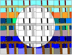
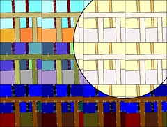
I chose this fabric as the background, as there is already a feeling of wide-openness in the upper right-hand half of it and a feeling of underbrush along the bottom edge (hand-dyed cotton by Elaine Quehl). I'll probably reverse appliqué patchwork windows into it and then paint or stencil silhouettes of birds flying across the open green area. I'll add more brushwood to the piece using dark shades of gray acrylic paint, on top of which I'll add large, dark, thorny brambles sewn in shades of gray and black fabric, probably reverse appliquéd, then hand and machine quilt the finished top.

I have two goals for this quilt. First, to capture something of the essence of the words cited above. And secondly, to create the feeling of three-dimensional space, so that the viewer has the impression of looking up through the underbrush, into the opening beyond, from a dark, enclosed space into a light, open one.

Now, I don't really like talking this much about what I intend to do and why. Call it superstition. Robert Genn talks about it here. However, I think I'll do it for the purpose of experimentation, as I believe a big part of what Sharon wants to do is have people share the development of a design from a simple key concept. We'll see where it goes.